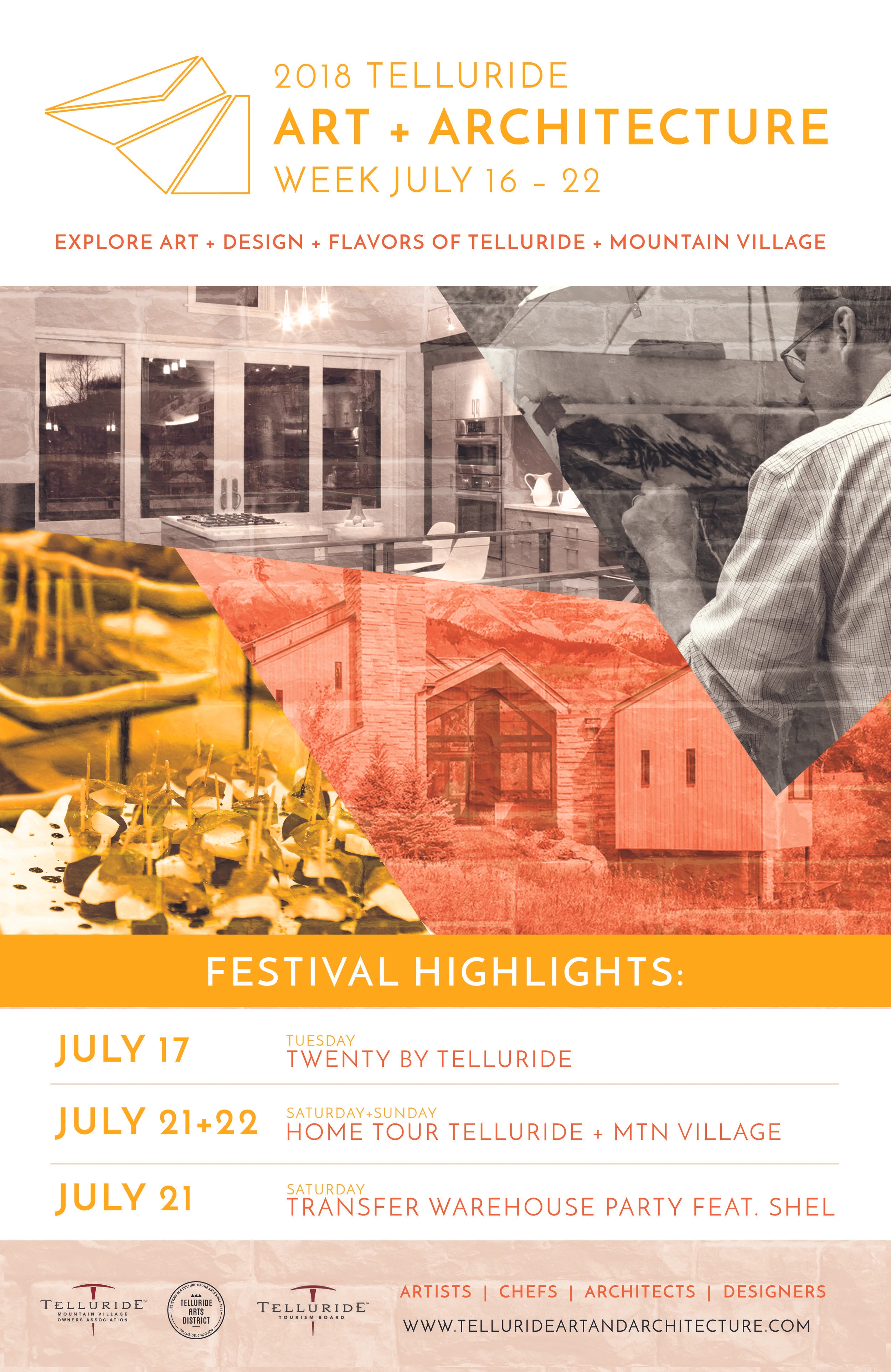
Telluride Art + Architecture Festival
Role
Experience & Brand Designer: Led visual identity, event design systems, and cross-touchpoint experience design
Overview
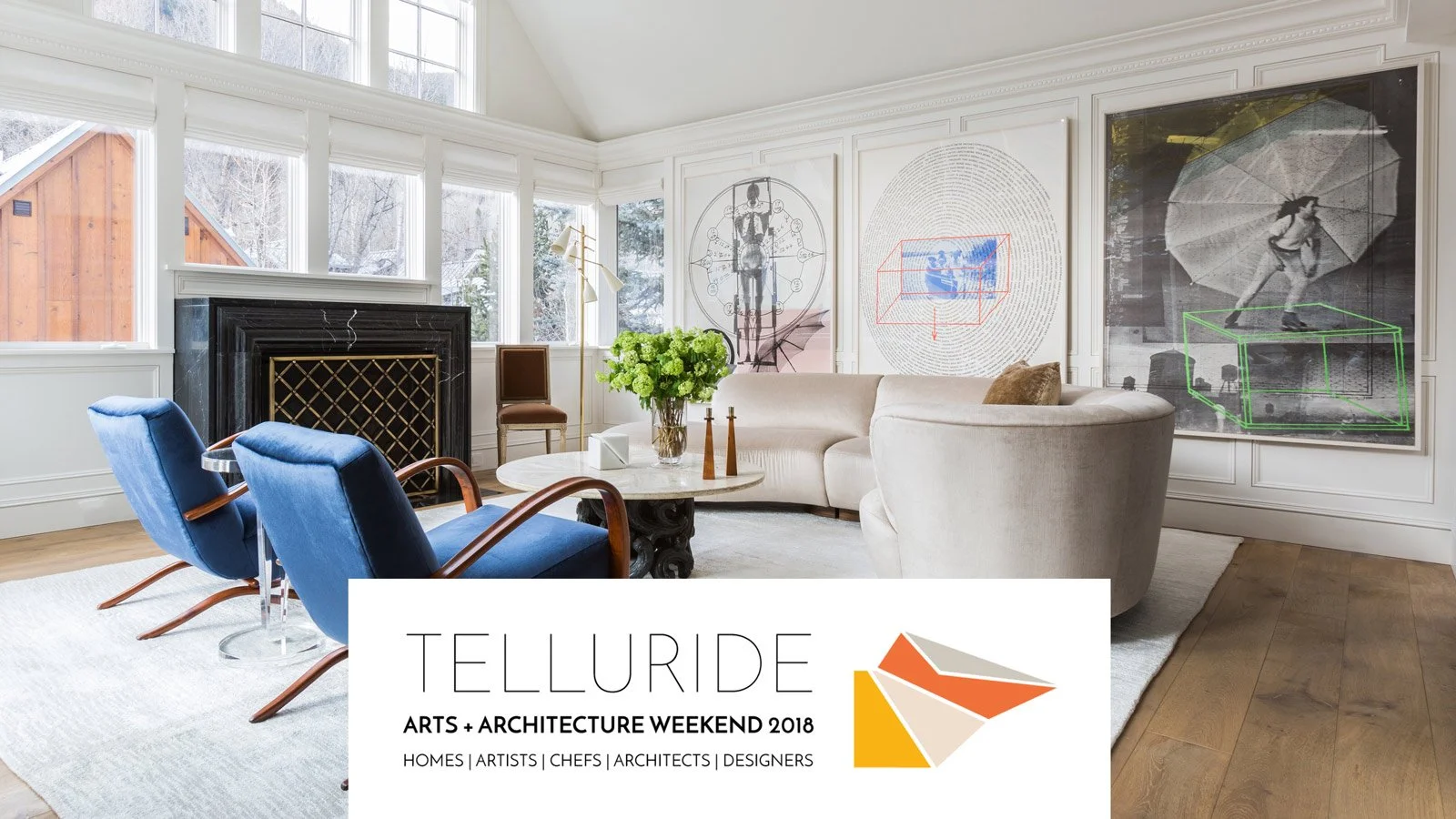
I partnered with the Telluride Art + Architecture Festival over four consecutive years, leading the design of a new visual identity each year for a multi-day cultural event that brings together architects, designers, artists, and chefs through immersive, self-guided experiences across the town.
The festival invites attendees to explore private homes, studios, and curated environments—blending architecture, art, and cuisine into a cohesive journey. My role focused on shaping the visual identity and experience design, ensuring the festival felt cohesive, navigable, and elevated across all touchpoints.
The Problem
The festival itself was highly unique—but the experience around it lacked clarity and cohesion.
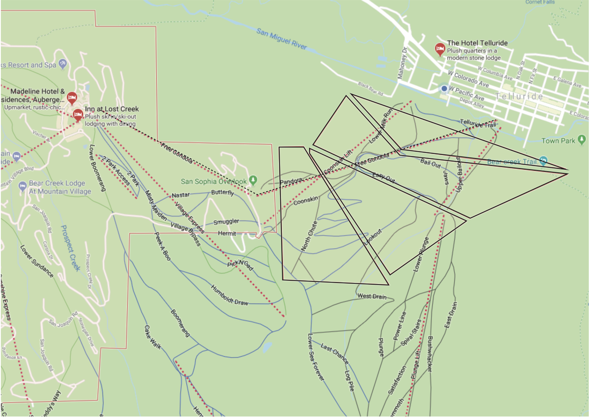
Multiple locations and experiences created complex navigation challenges
Brand expression varied across materials and environments
Attendees needed to understand where to go, what they were seeing, and why it mattered
The experience risked feeling fragmented instead of curated
This wasn’t just a branding problem—it was an experience design problem across physical space.
Opportunity
Turn a distributed, multi-location event into a cohesive, story-driven experience.
Design a system that connects:
Place (homes, venues, landscape) People (artists, architects, chefs) Narrative (what each stop represents)
Approach
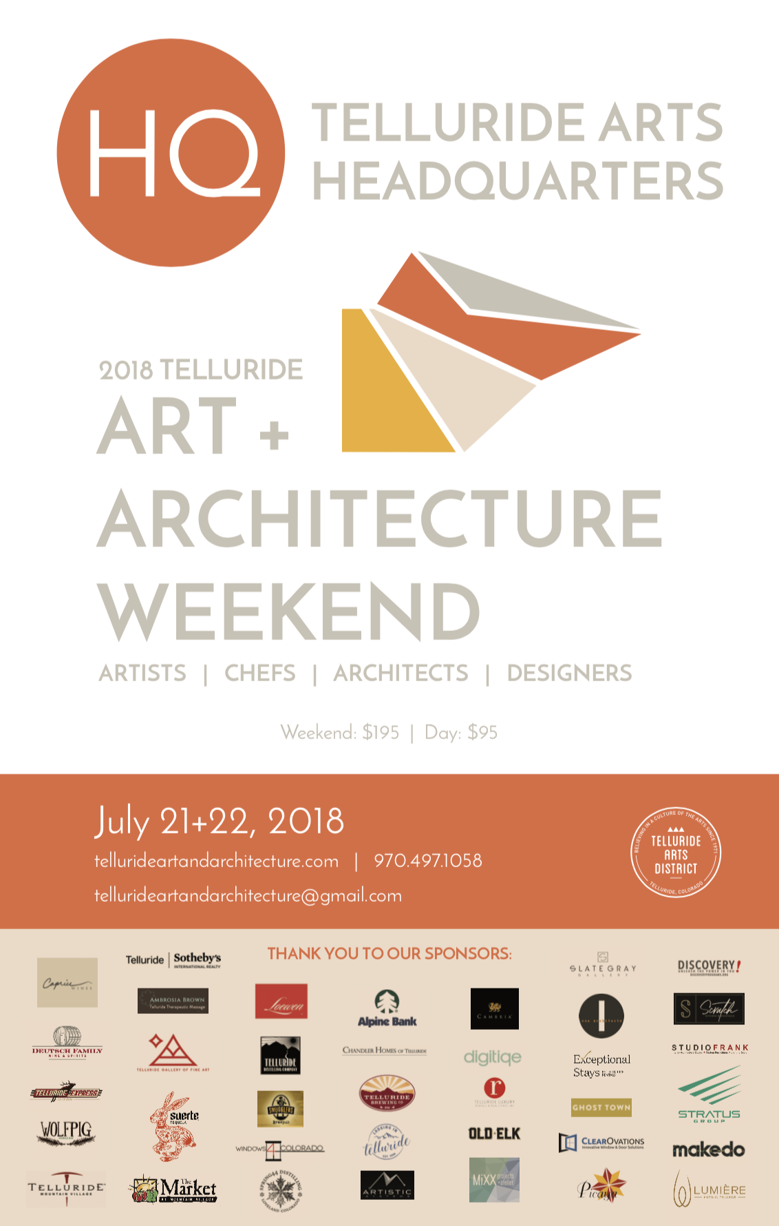
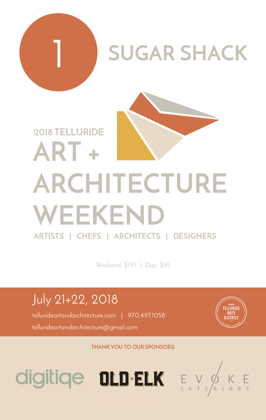
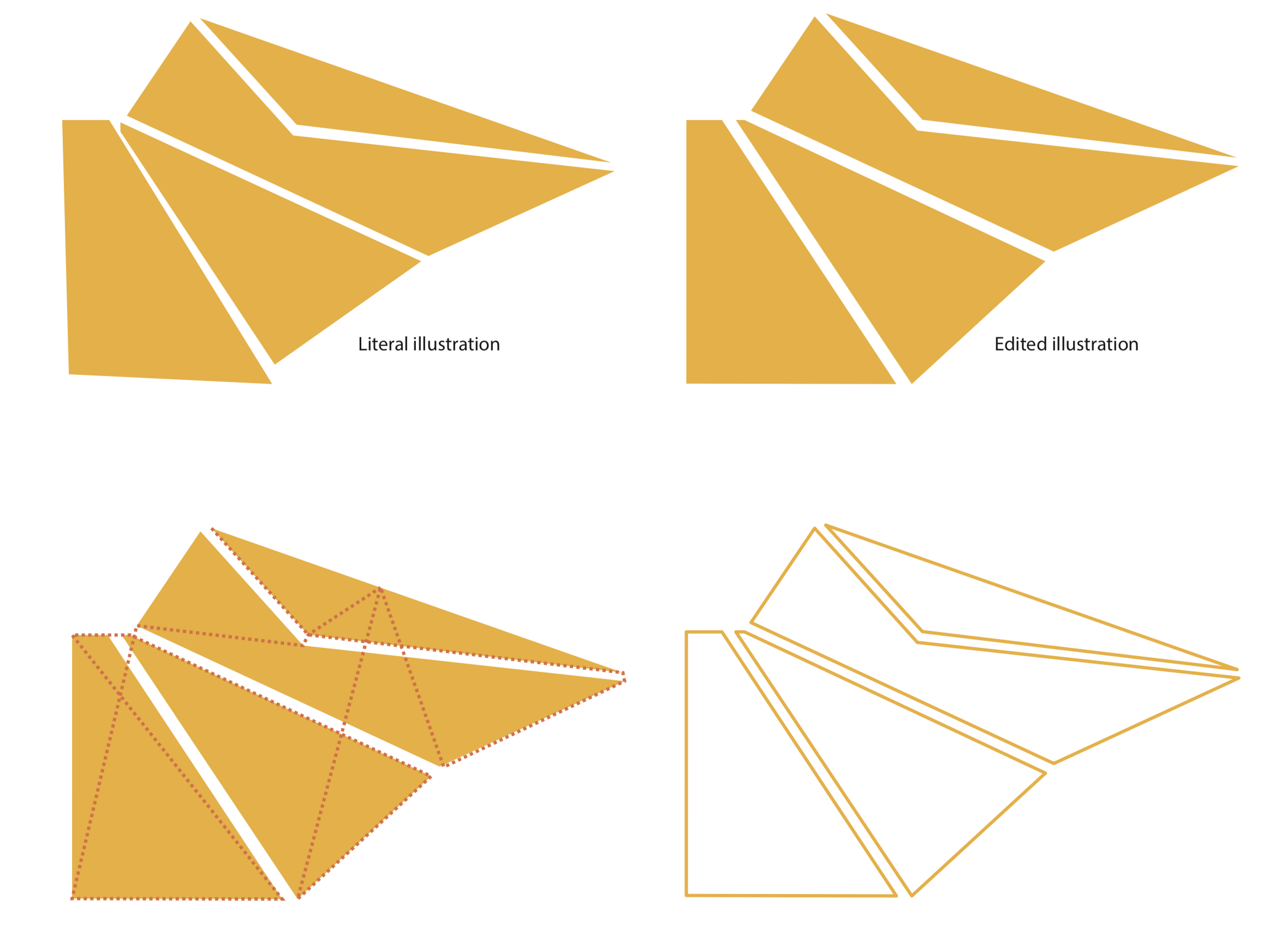
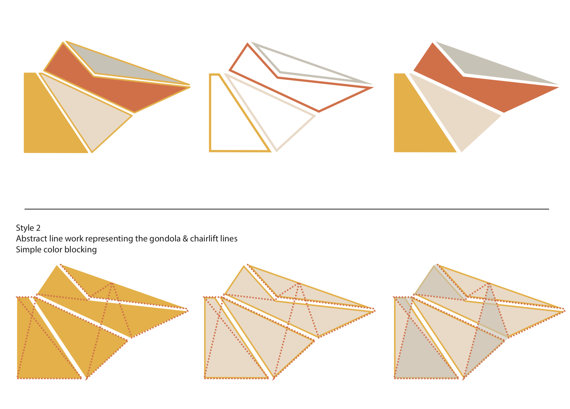
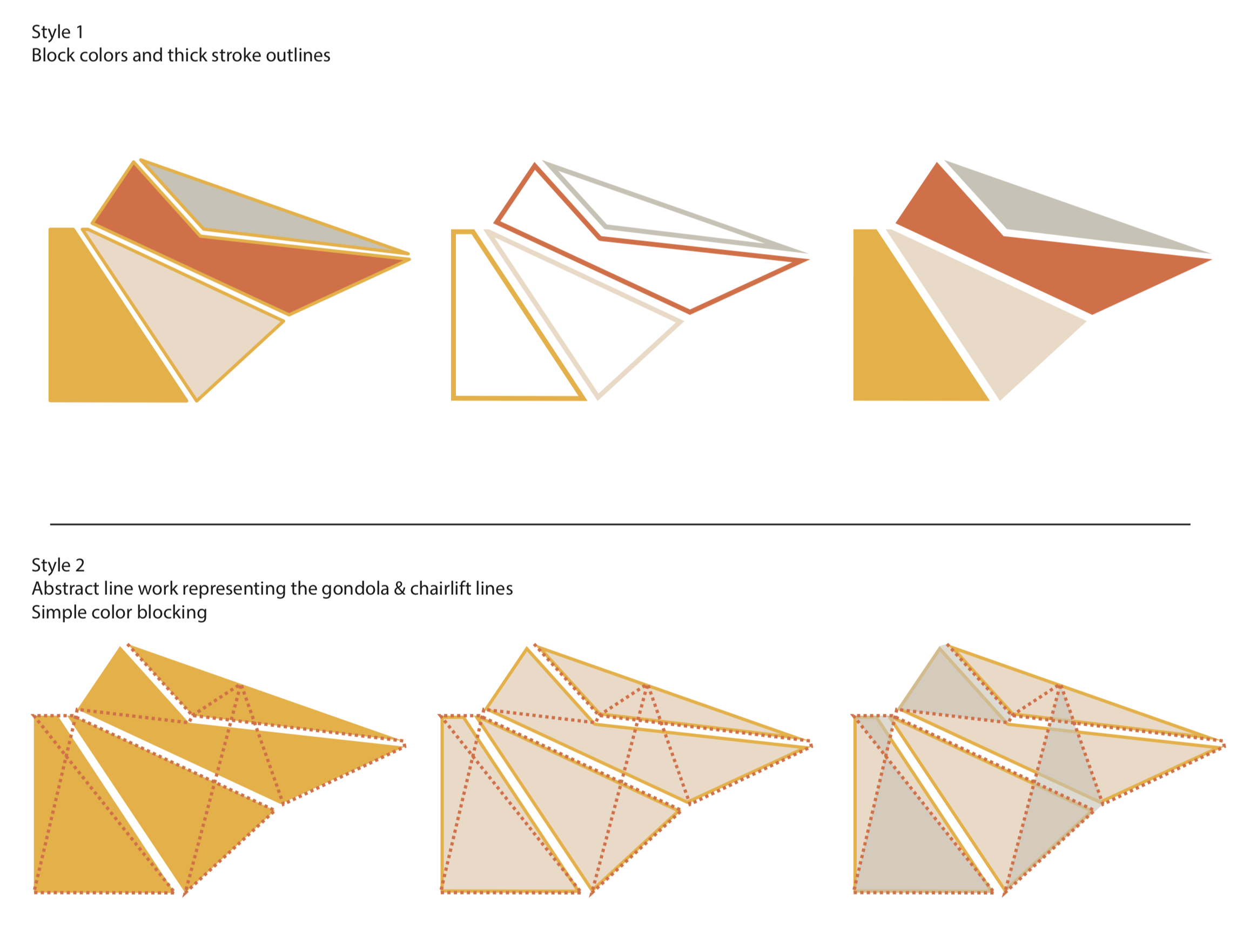
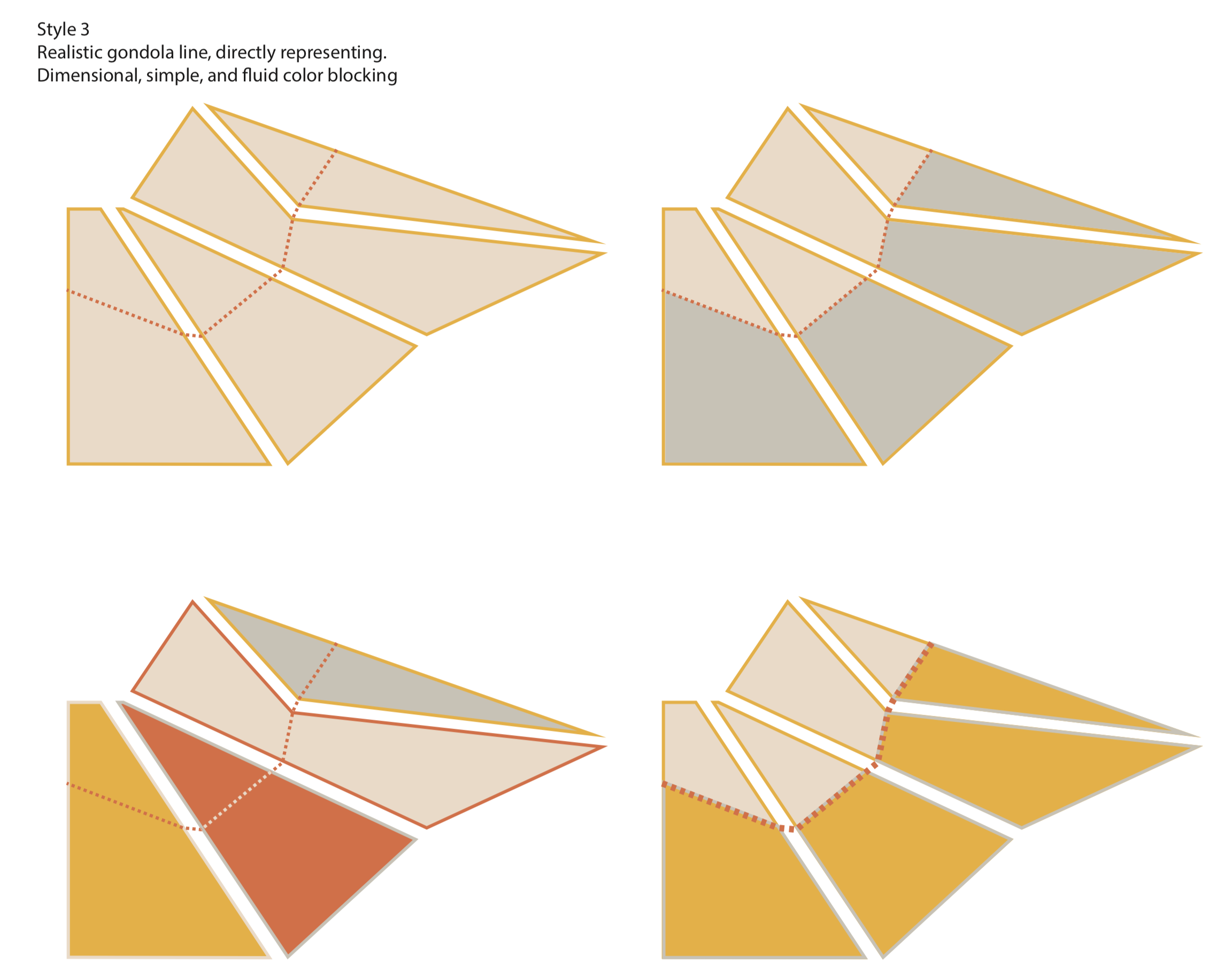
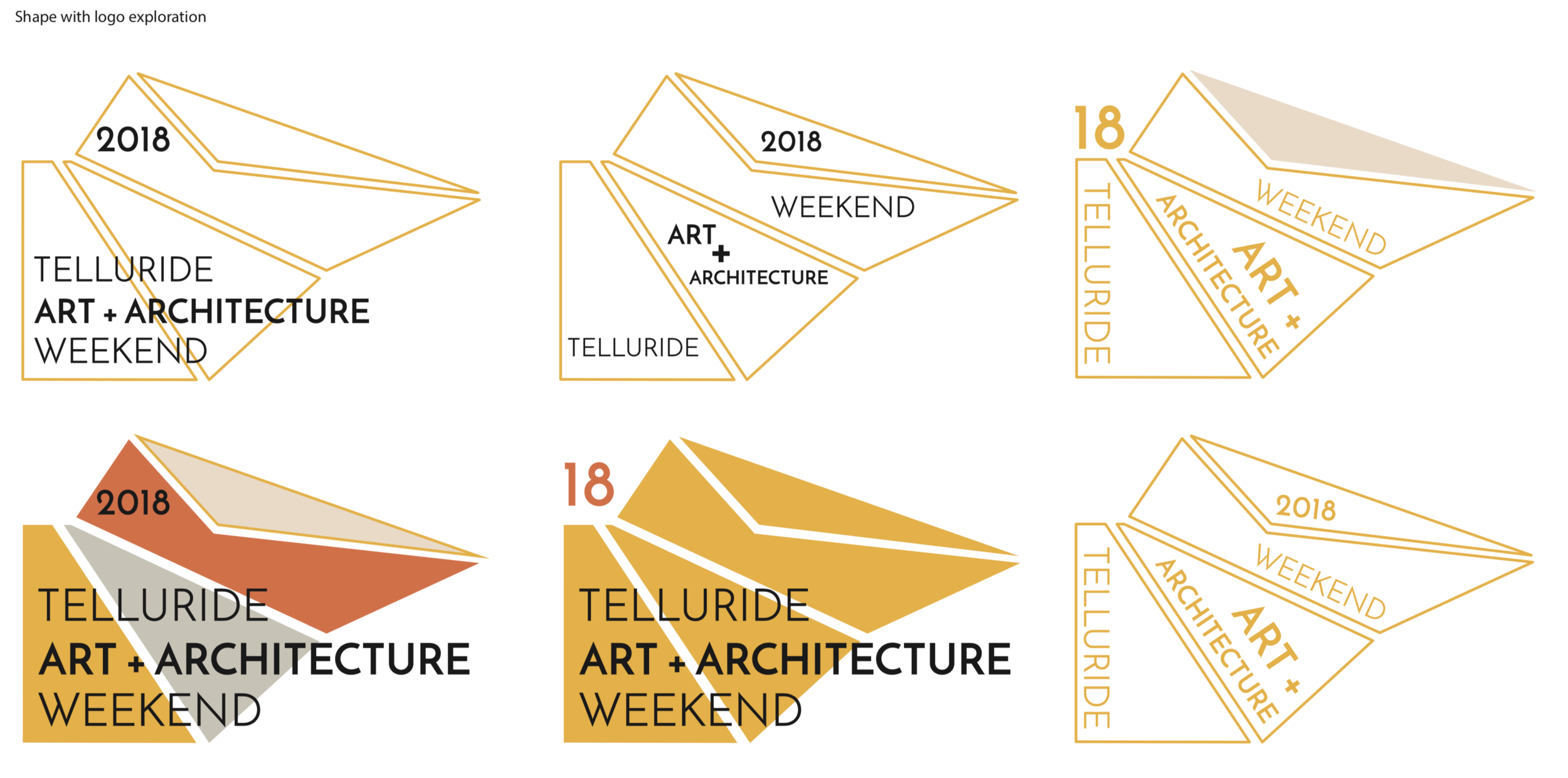
1. Create a unified visual identity
I developed a visual language that could tie together diverse environments and contributors:
A clean, modern aesthetic that complemented both historic and contemporary spaces
Typography and layout systems that felt editorial and refined
A visual tone that balanced high design with approachability
This created a consistent foundation across all festival materials.
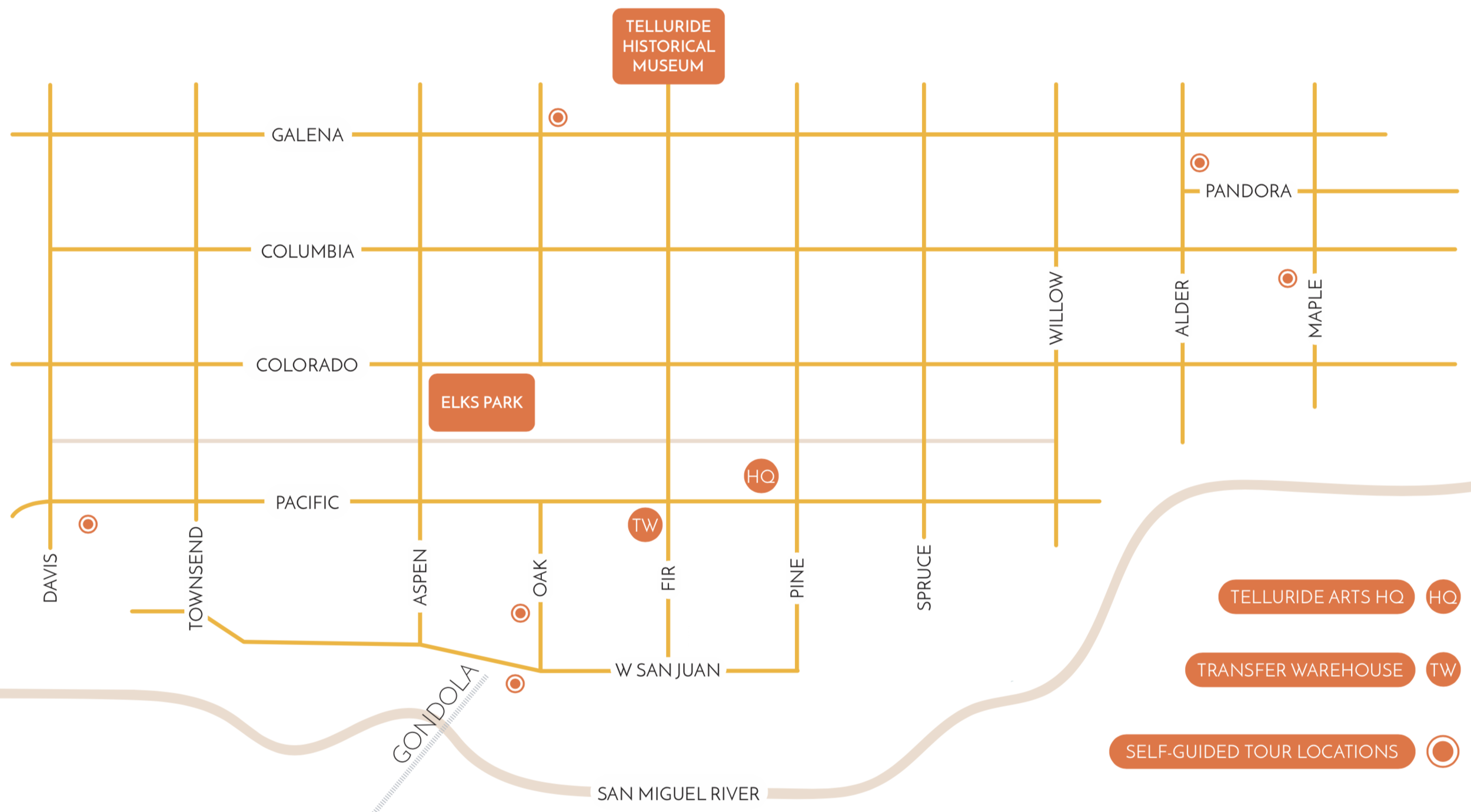
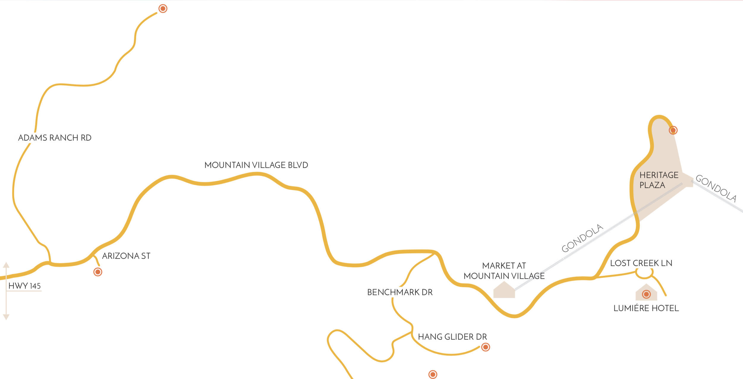
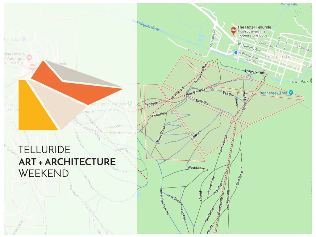
2. Design for navigation and flow
The festival operates as a self-guided experience across multiple locations.
I focused on making the journey intuitive:
Clear hierarchy in maps, guides, and materials
Structured information to help attendees understand each stop
Visual cues that made it easy to move between locations
The goal was to reduce friction while preserving a sense of discovery.
3. Translate environments into a cohesive story
Each location featured a collaboration between creatives—architects, designers, chefs, and artists.
I helped frame these as part of a larger narrative:
Positioned each stop as a distinct but connected experience
Created consistency in how information and storytelling were presented
Ensured the brand tied everything together across different physical settings
4. Balance structure with exploration
The experience needed to feel curated—but not rigid.
I designed systems that allowed attendees to:
Navigate confidently
Explore freely at their own pace
Engage with each space in a meaningful way
This balance was key to preserving the spirit of the festival.
5. Extend the brand across physical and digital touchpoints
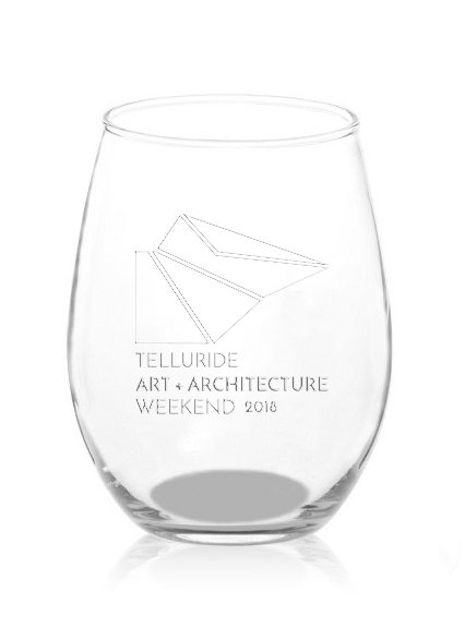
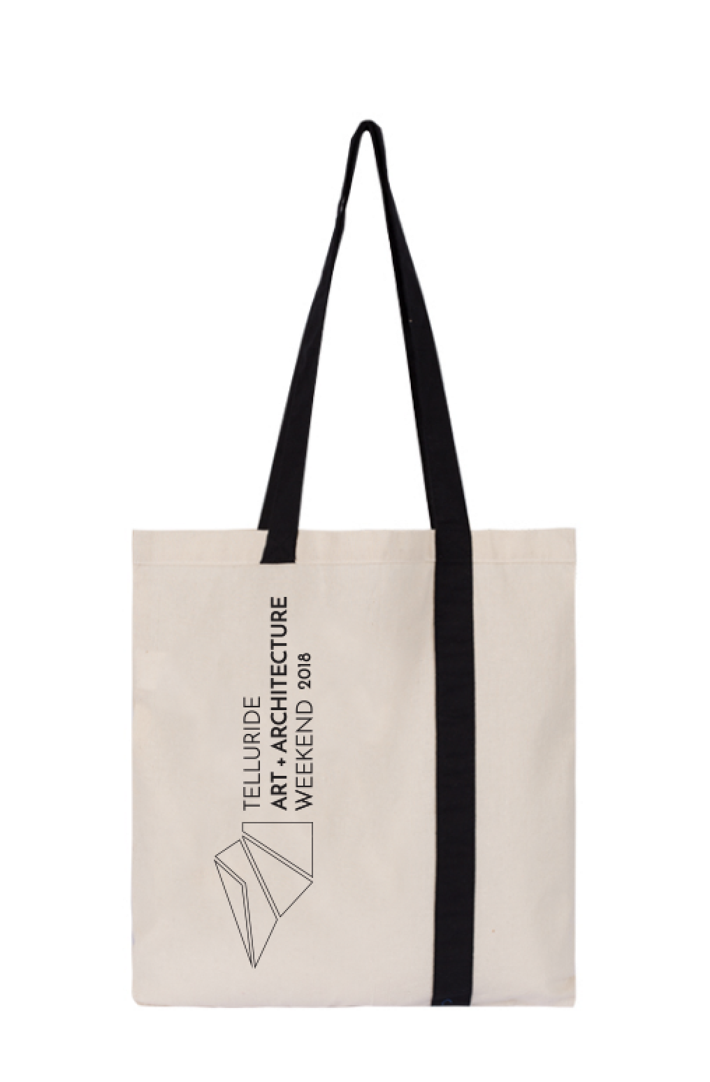
From printed materials to on-site experiences, I ensured the identity carried through:
Event collateral and guides
Environmental graphics and signage
Supporting digital touchpoints
This created a seamless experience from planning to participation.
Impact
Transformed a complex, multi-location event into a cohesive, navigable experience
Established a consistent visual identity across diverse environments and contributors
Improved attendee understanding of both logistics and storytelling
Elevated the perception of the festival as a curated, design-forward experience
Created a scalable system for future iterations of the event
What I Learned
Designing for a distributed, real-world experience reinforced a key principle:
Great design doesn’t just guide people—it shapes how they move through a space.
By connecting brand, navigation, and storytelling, we turned a series of individual moments into a unified journey.
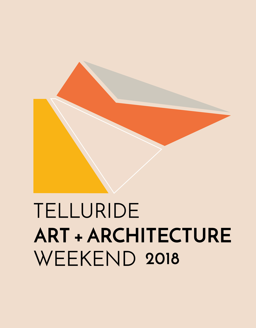
LOGO + COLOR PALETTE
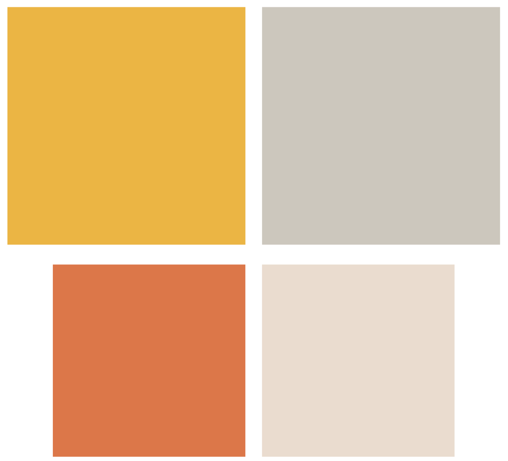
Creating a well-rounded 4-color palette that would apply well to both web and print was the goal. Complementing two bold colors with two softer ones made the palette full.
LOGO DEVELOPMENT
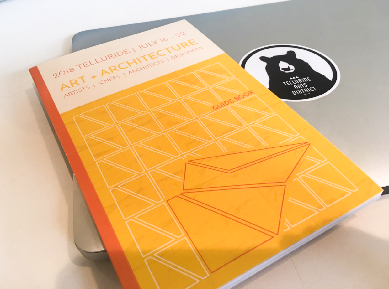
GUIDEBOOK
100+ page layout design
Cover Design
Color palette design + application
Hierarchy + formatting
Photo production + filter design
Proofing for production