NewEra Healthy Eating
Designing a modern cookbook from brand to page
Role
Brand & Editorial Designer: Led brand identity, visual direction, and full book layout design from concept through final production
Overview
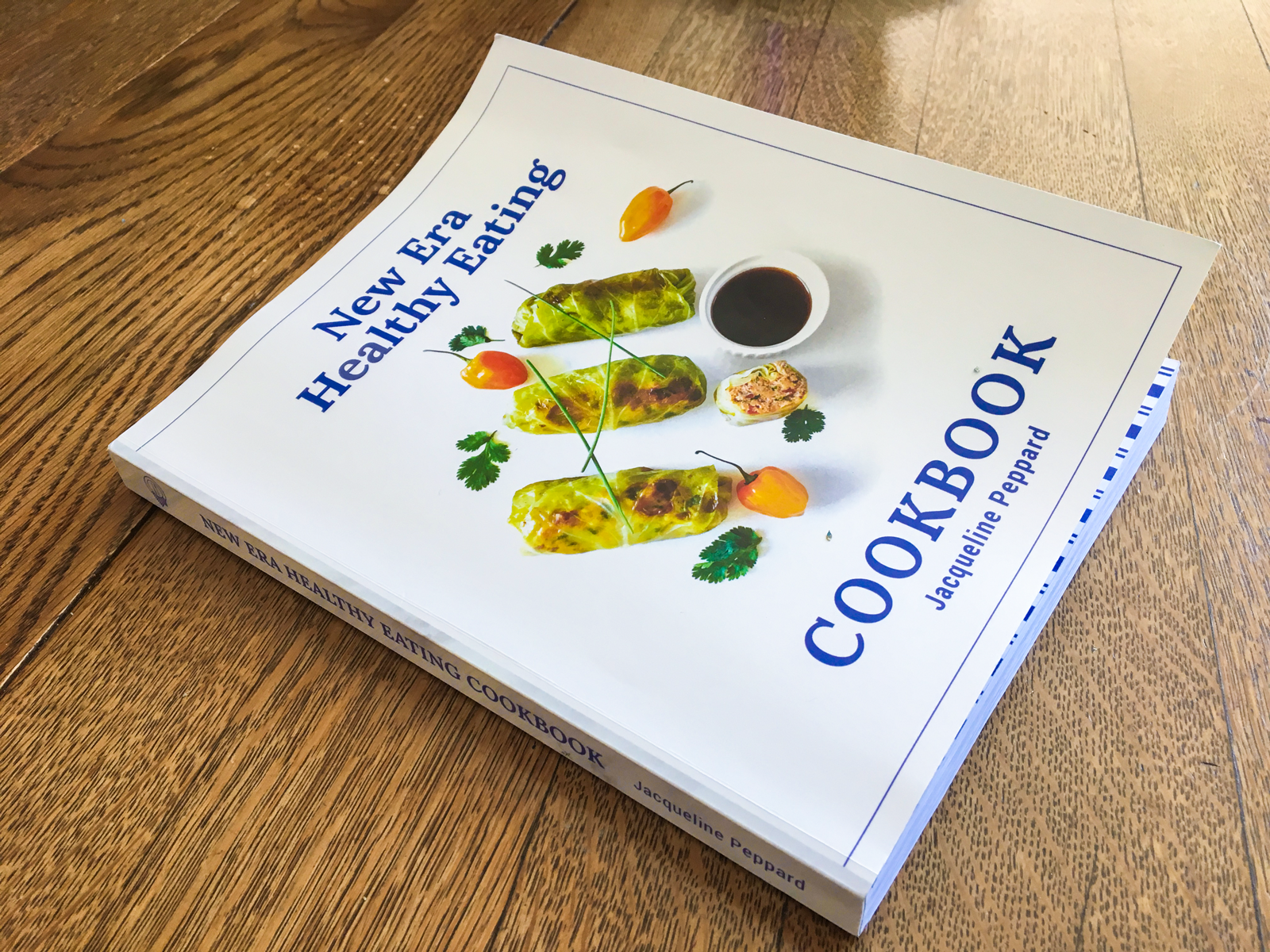
I led the end-to-end creative direction for New Era Healthy Eating, developing the brand identity and designing the full cookbook experience—from visual language to page-by-page layout. The project aimed to reframe healthy eating as something approachable, inspiring, and visually engaging—moving away from overly clinical or restrictive aesthetics often seen in the category. My role was to create a cohesive system that could bring together brand, content, and storytelling into a unified, tangible product.
The Problem
Most healthy eating content feels one of two ways:
Overly rigid and instructional
Or overly stylized without clarity
This cookbook needed to strike a balance:
Educational but not overwhelming
Beautiful but still highly usable
Modern while remaining approachable
At the same time, there was no existing brand system—everything needed to be built from the ground up.
Opportunity
Create a cookbook that feels like a lifestyle experience, not just a collection of recipes.
Design a system that invites people in, builds trust, and makes healthy eating feel achievable.
Approach
1. Build the brand from the ground up
I developed a complete visual identity for New Era Healthy Eating, establishing:
Typography that felt clean, modern, and editorial
A color palette that balanced freshness with warmth
A visual tone that avoided both “clinical” and “overly trendy”
The goal was to create a brand that felt credible, welcoming, and contemporary.


2. Design a system for long-form content
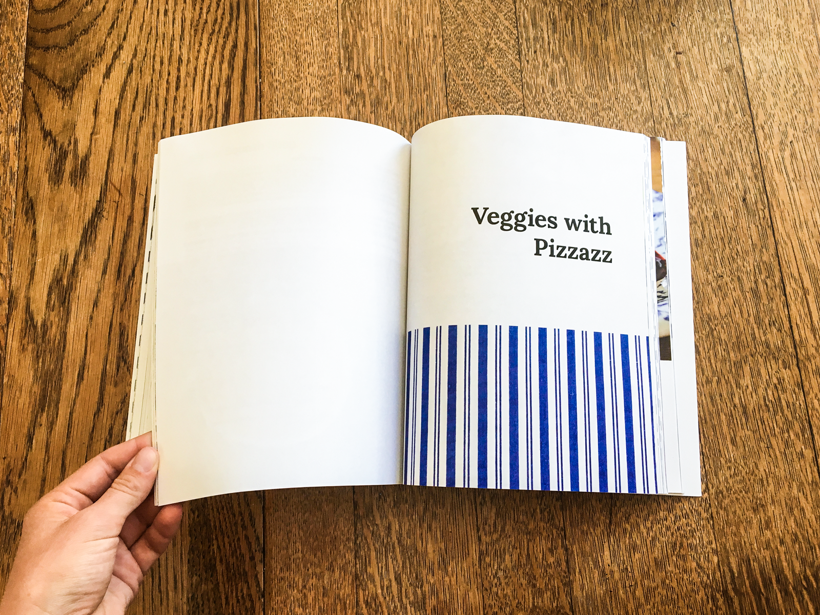
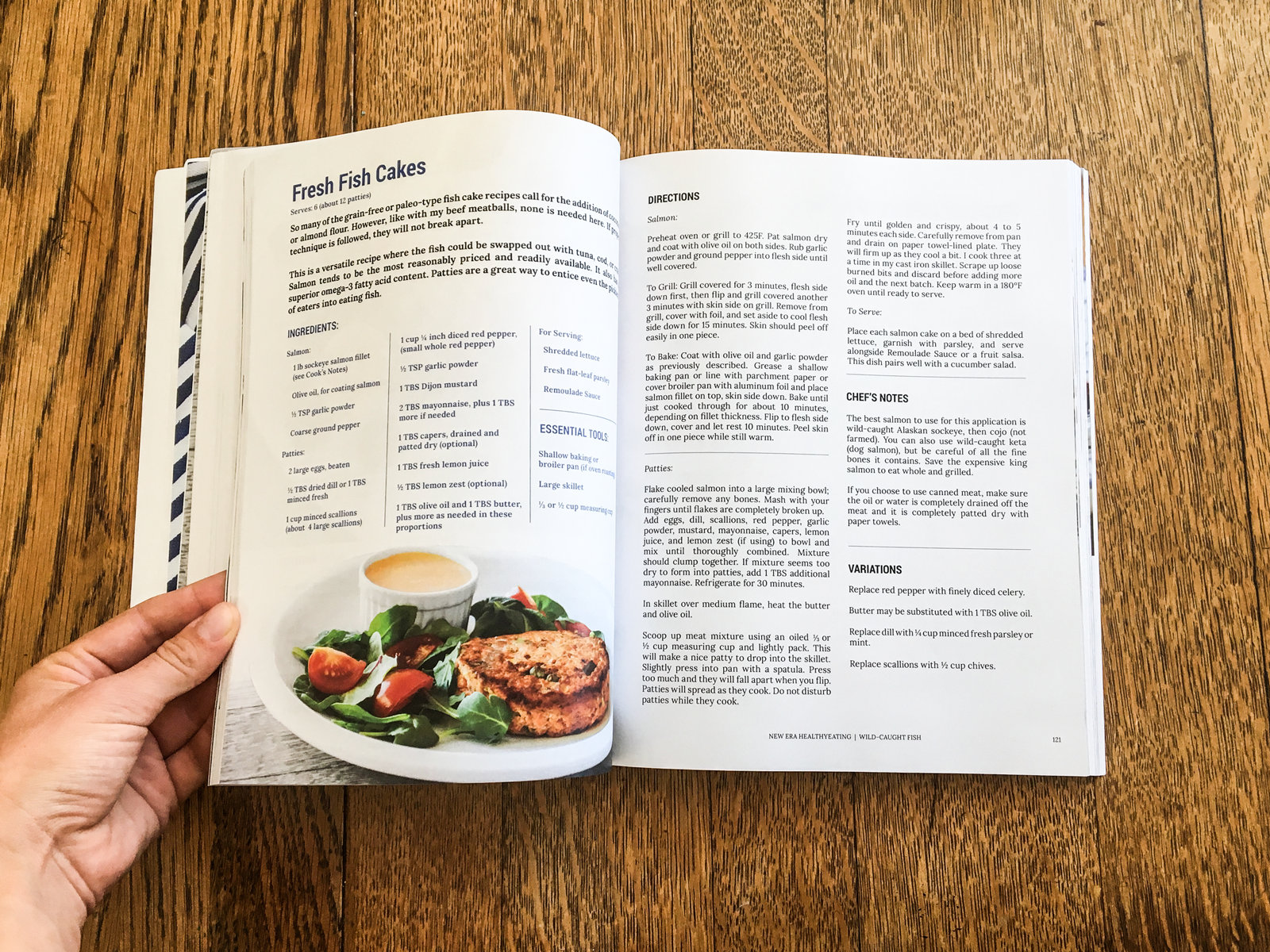
Cookbooks are complex systems—they need to balance storytelling, instruction, and usability.
I created a structured layout system that could scale across the entire book, including:
Recipe templates with clear hierarchy and readability
Section dividers and pacing to guide the reader
Consistent spacing, rhythm, and grid systems
Flexible components for tips, callouts, and nutritional context
This ensured the book felt cohesive from beginning to end.
3. Balance beauty with function
Every design decision had to support both aesthetic appeal and real-world use.
I focused on:
Making recipes easy to scan while cooking
Creating clear visual hierarchy between ingredients, steps, and notes
Designing pages that felt calm and uncluttered
The result was a book that works just as well on a kitchen counter as it does as an object of inspiration.
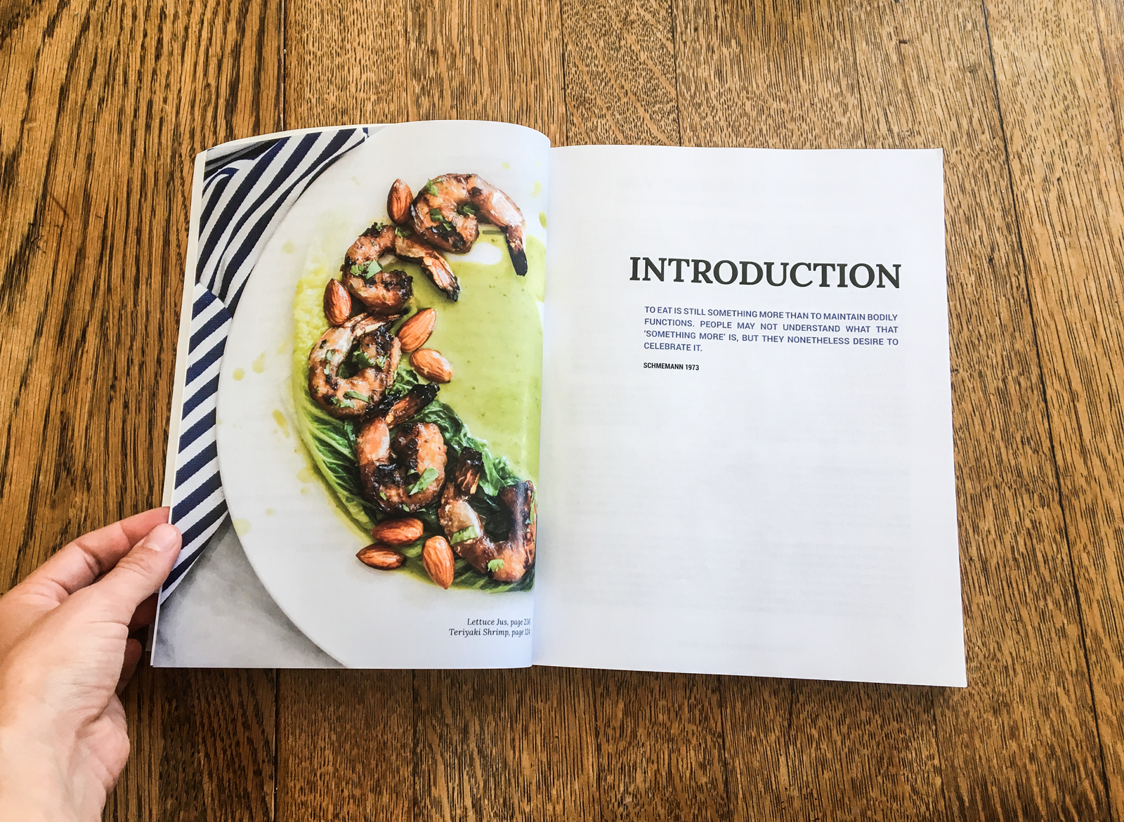
4. Create an editorial storytelling experience
Beyond recipes, the book needed to communicate a broader philosophy around food and lifestyle.
I used layout, typography, and pacing to:
Create moments of pause and reflection
Introduce sections with narrative context
Blend instructional content with lifestyle storytelling
This elevated the book from functional to experiential.
5. Maintain consistency across every page
With a project of this scale, consistency is everything.
I ensured:
Every page adhered to the same visual system
Typography and spacing remained consistent throughout
The brand identity carried through from cover to final page
This created a seamless, polished end-to-end experience.
Impact
Delivered a fully realized brand identity and cookbook design system from concept to final production
Created a cohesive, scalable layout across an entire long-form publication
Transformed complex nutritional content into an accessible, engaging reading experience
Elevated the perception of the book from instructional to editorial and lifestyle-driven
Established a strong visual foundation for future brand expansion
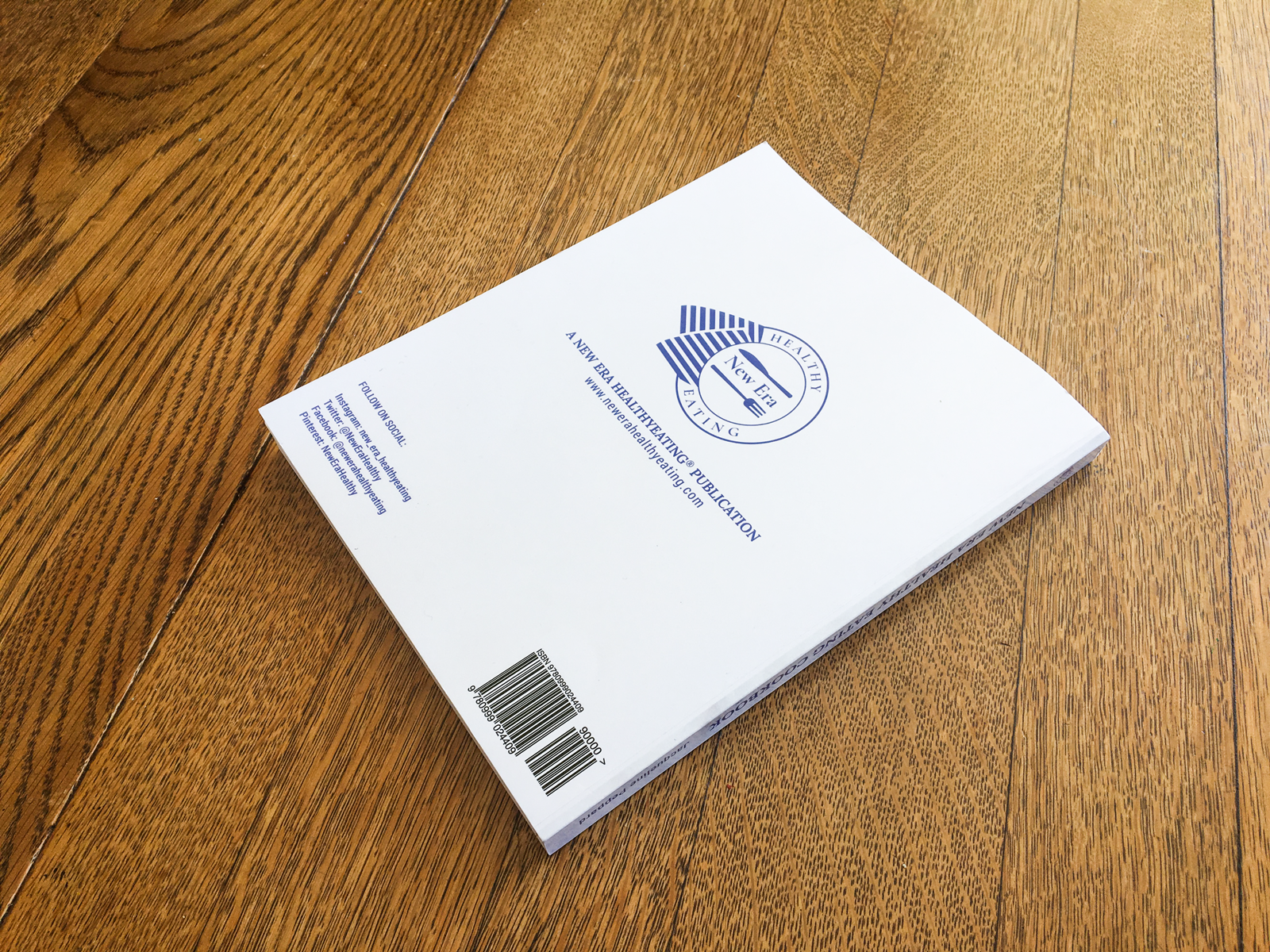
The author was able to self-publish on Amazon: New Era Healthy Eating
What I Learned
Designing a full book reinforced a key principle:
Great design isn’t just about individual pages—it’s about rhythm over time.
Every decision—from typography to spacing to pacing—contributes to how the reader experiences the content as a whole.