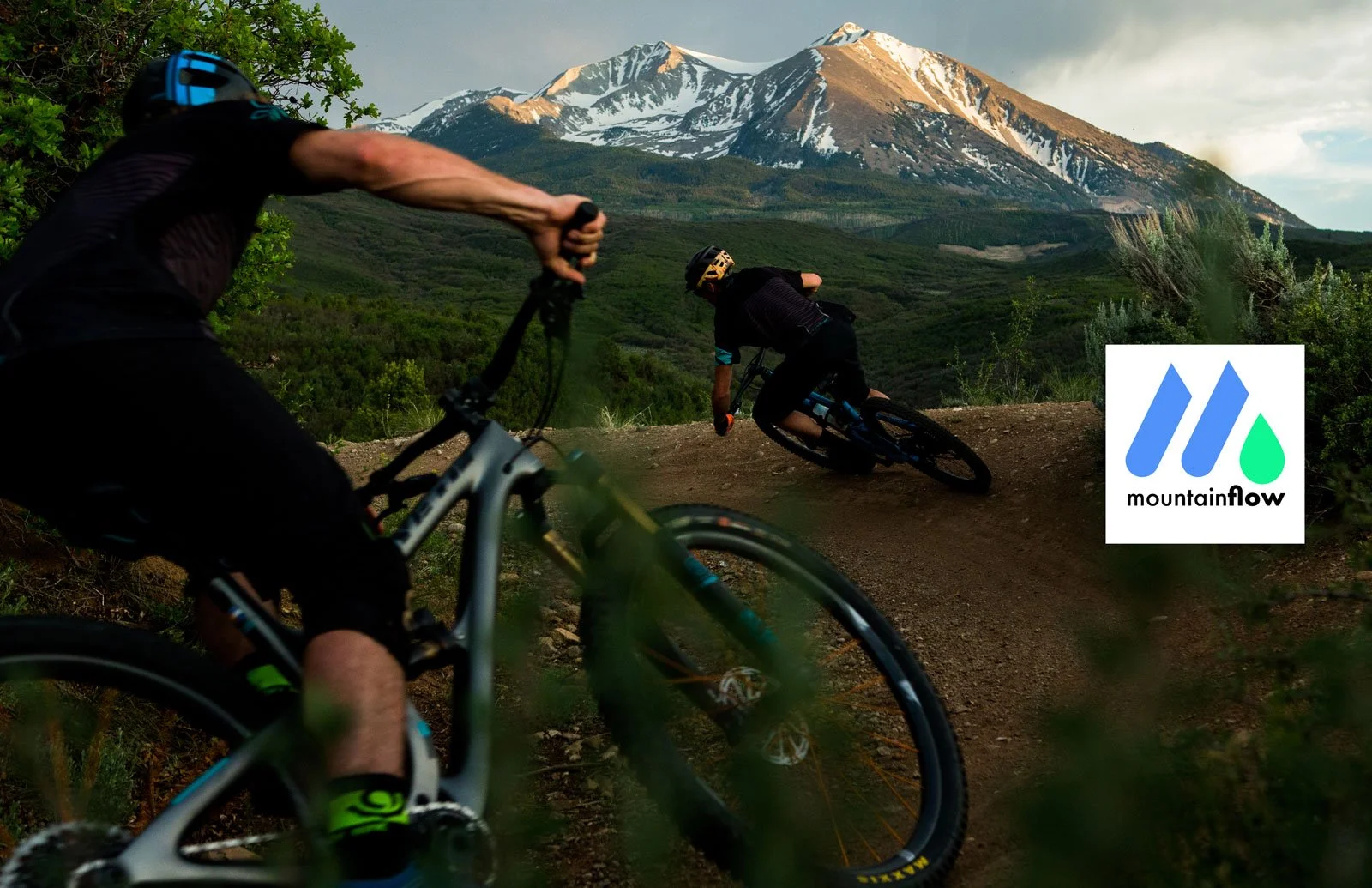
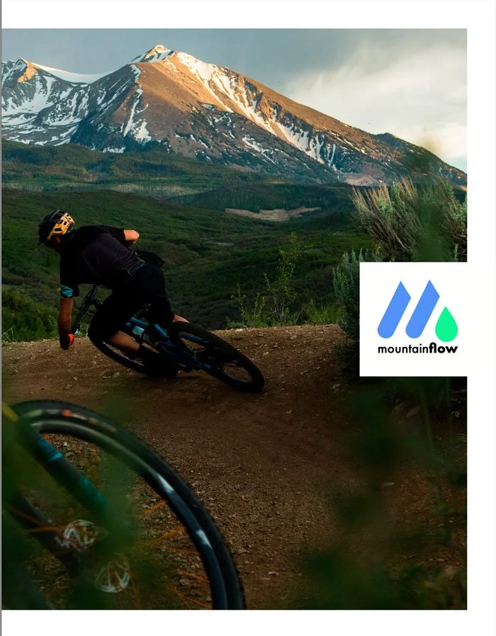
MountainFlow
Bringing sustainability to life through product and brand
Role
Brand & Packaging Designer: Led creative direction for packaging and sales materials, collaborating with internal teams to bring the brand to life across physical touchpoints
Overview
I partnered with mountainFLOW, an outdoor brand redefining performance products through sustainability—creating plant-based, biodegradable ski and snowboard wax designed to replace traditional petroleum-based alternatives.
As the brand expanded its product line, they needed a cohesive visual system that could translate their mission into physical touchpoints—from packaging to sales materials. I led the design of new packaging artwork and a lookbook catalog, helping bring clarity, personality, and consistency to how the brand showed up in the market.
The Problem
MountainFLOW had a strong product story—but their visual expression didn’t fully reflect it.
Packaging lacked a cohesive, ownable visual identity
Product storytelling wasn’t clearly communicated at the point of sale
Sales reps needed better tools to communicate product value in the field
Sustainability—a core differentiator—wasn’t fully brought to life visually
The challenge was to create a system that could bridge product, brand, and storytelling across physical formats.
Opportunity
Translate MountainFLOW’s mission into a visual language that feels:
Authentic to the outdoor community
Clear and educational (especially around sustainability)
Distinctive on shelf and in use
Build a brand experience that works both in-hand (packaging) and in-conversation (sales materials)
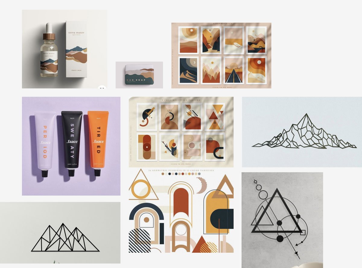
Packaging Moodboard
Approach
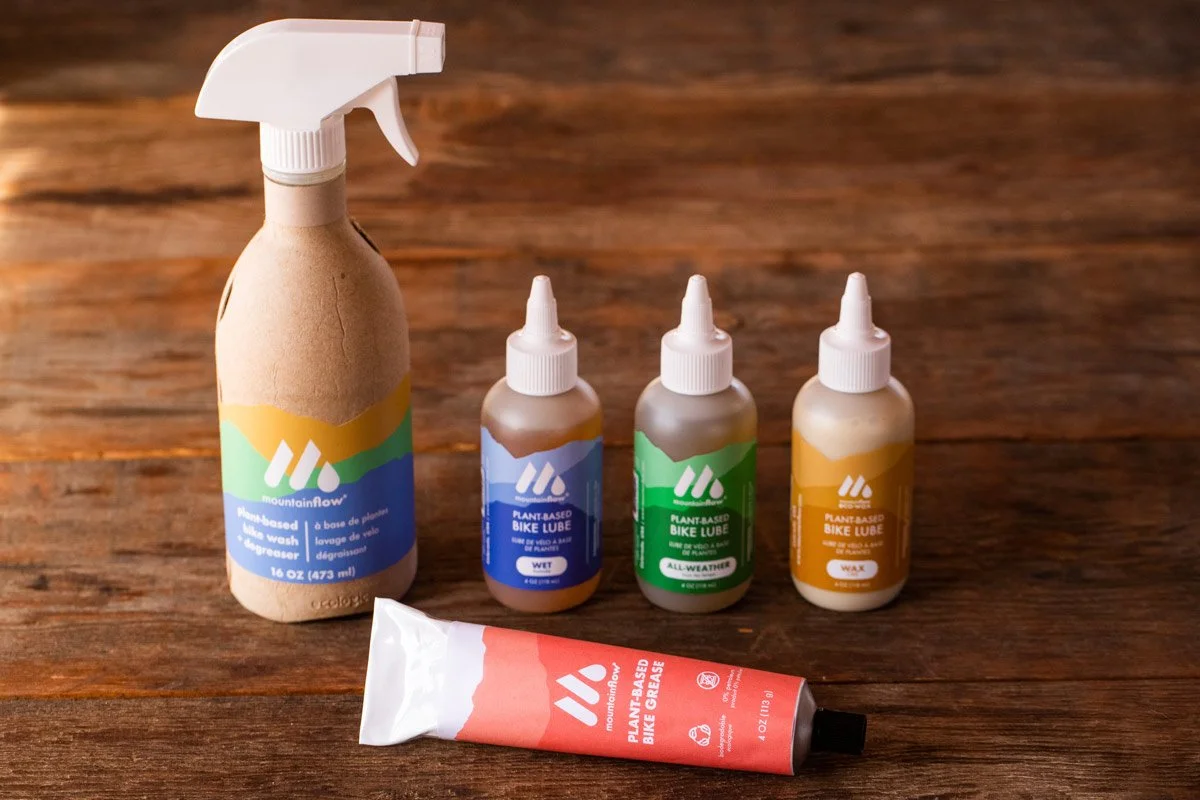
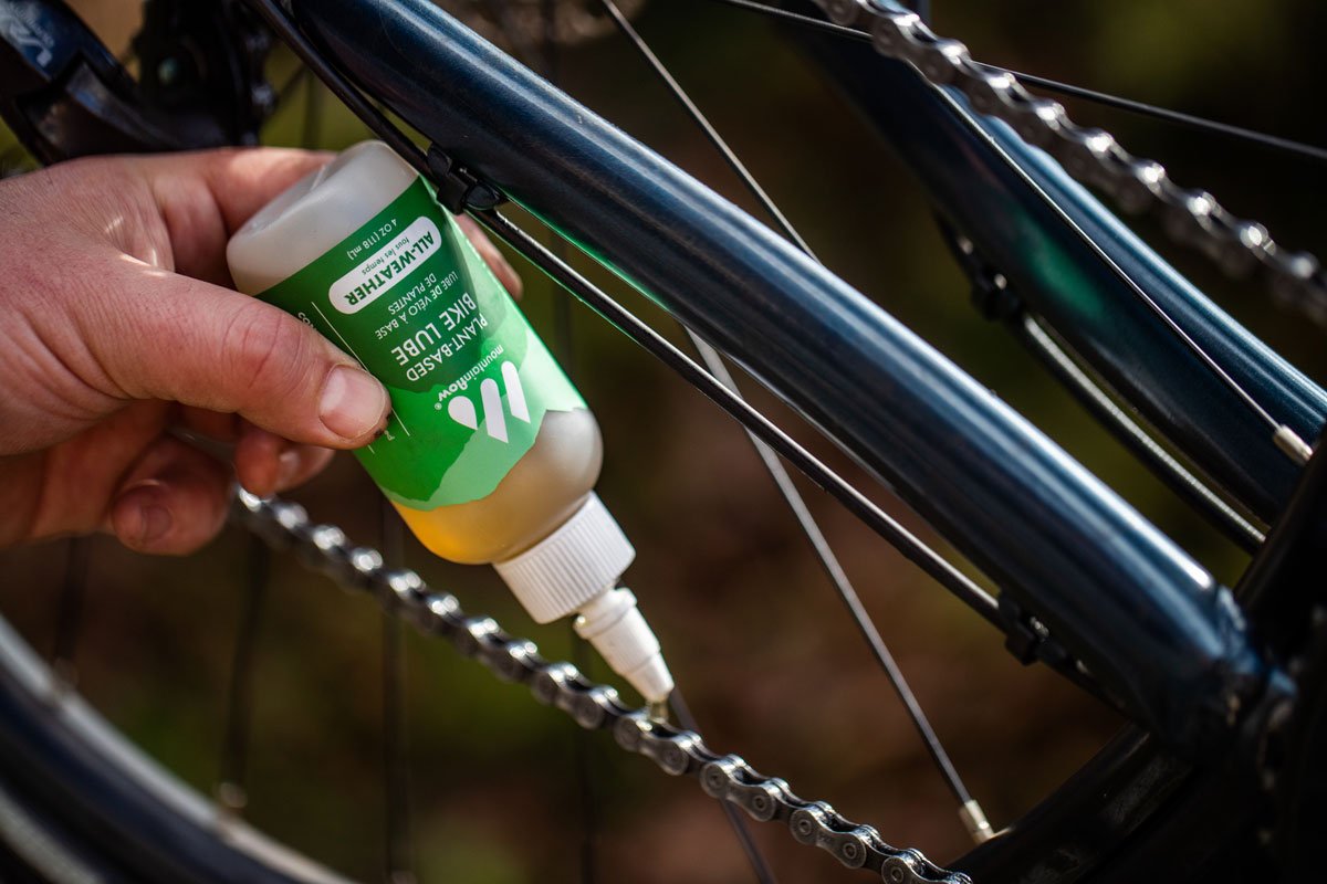
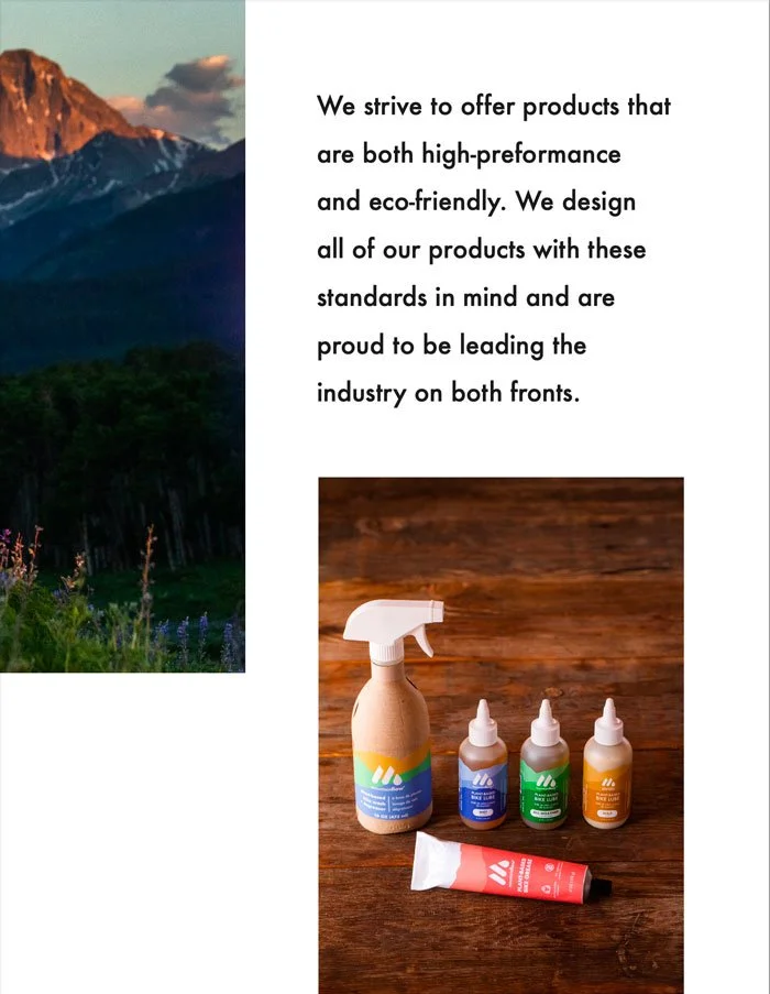
1. Develop original packaging artwork
I created a new visual direction for product packaging that aligned with the brand’s core values:
Designed original artwork that reflected the natural environments their products protect
Balanced technical performance cues with an approachable, outdoor-driven aesthetic
Elevated shelf presence while maintaining clarity and usability
The goal was to make the packaging feel as thoughtful and differentiated as the product itself.
2. Translate sustainability into a visual system
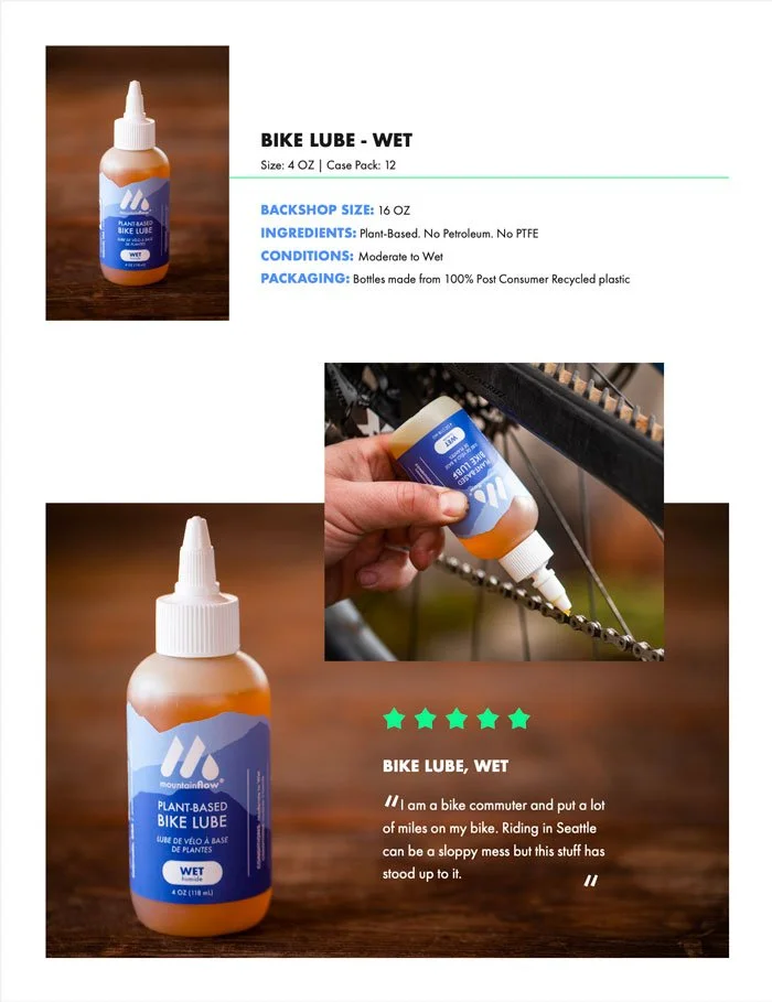
MountainFLOW’s products are plant-based, biodegradable, and non-toxic—a major differentiator in a category dominated by petroleum-based alternatives.
I focused on making that story immediately legible through design:
Clear visual hierarchy to communicate product benefits
Iconography and layout systems to reinforce eco-friendly attributes
A tone that felt credible, not overly “greenwashed”
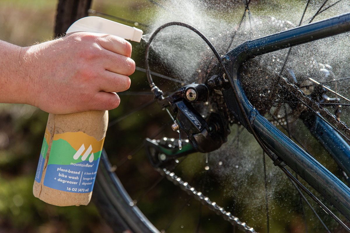
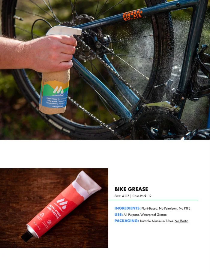
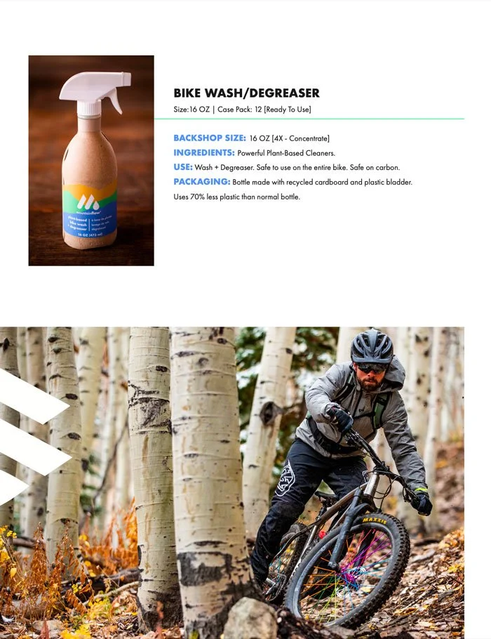
3. Design for real-world use (retail + field)
Packaging needed to perform in multiple contexts:
On shelf (standing out visually)
In a biker’s kit (durable, readable, functional)
In rep conversations (quickly communicating value)
I designed with these real-world use cases in mind, ensuring the system worked beyond just aesthetics.
4. Create a lookbook catalog for sales reps
To support wholesale and field sales, I designed a lookbook catalog that:
Showcased the full product line in a cohesive format
Communicated product benefits and use cases clearly
Gave reps a polished, easy-to-use tool for buyer conversations
This extended the brand beyond packaging into a sales enablement experience.
5. Build consistency across touchpoints
By aligning packaging and the lookbook under a shared visual system, I helped create:
A more unified brand presence
Stronger recognition across channels
A foundation for future product expansion
Impact
Established a cohesive packaging system with original artwork across product lines
Elevated shelf presence and brand recognition in a competitive outdoor category
Translated complex sustainability messaging into clear, accessible design
Equipped sales reps with a lookbook catalog to improve product storytelling and conversion
Strengthened MountainFLOW’s positioning as a performance-driven, sustainability-first brand
What I Learned
Designing for physical products reinforced a key difference from digital:
You don’t just design how something looks—you design how it lives in the world.
From shelf presence to in-hand use to sales conversations, every touchpoint needed to work together to tell a cohesive story.