Carver Brewing
Reimagining craft beer packaging through storytelling and illustration
Role
Brand & Packaging Designer: Led concept development, illustration, and label design across multiple SKUs
Overview
I partnered with Carver Brewing Co., one of Colorado’s original craft breweries, to design a series of custom beer labels that brought new energy and storytelling to their product lineup.
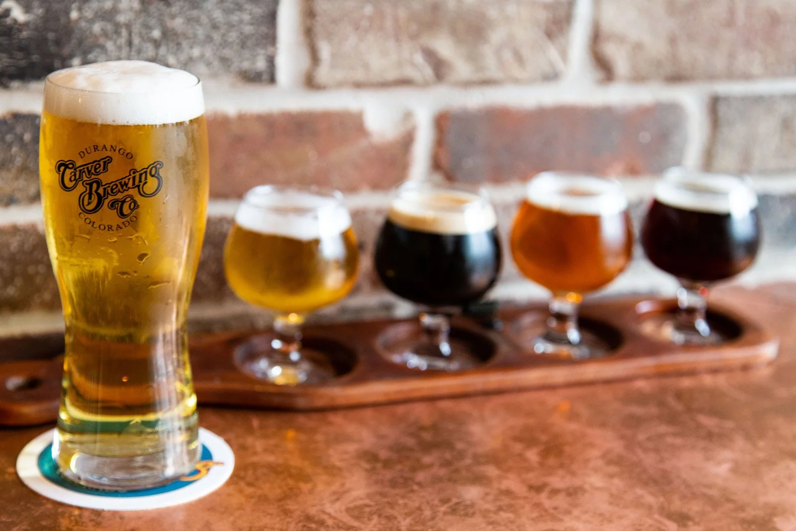
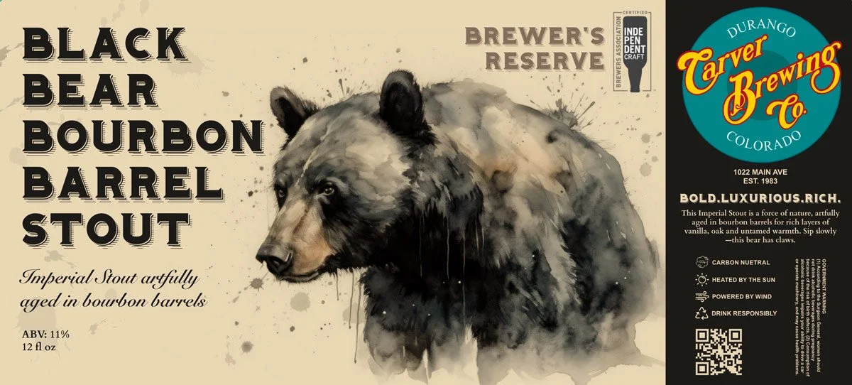
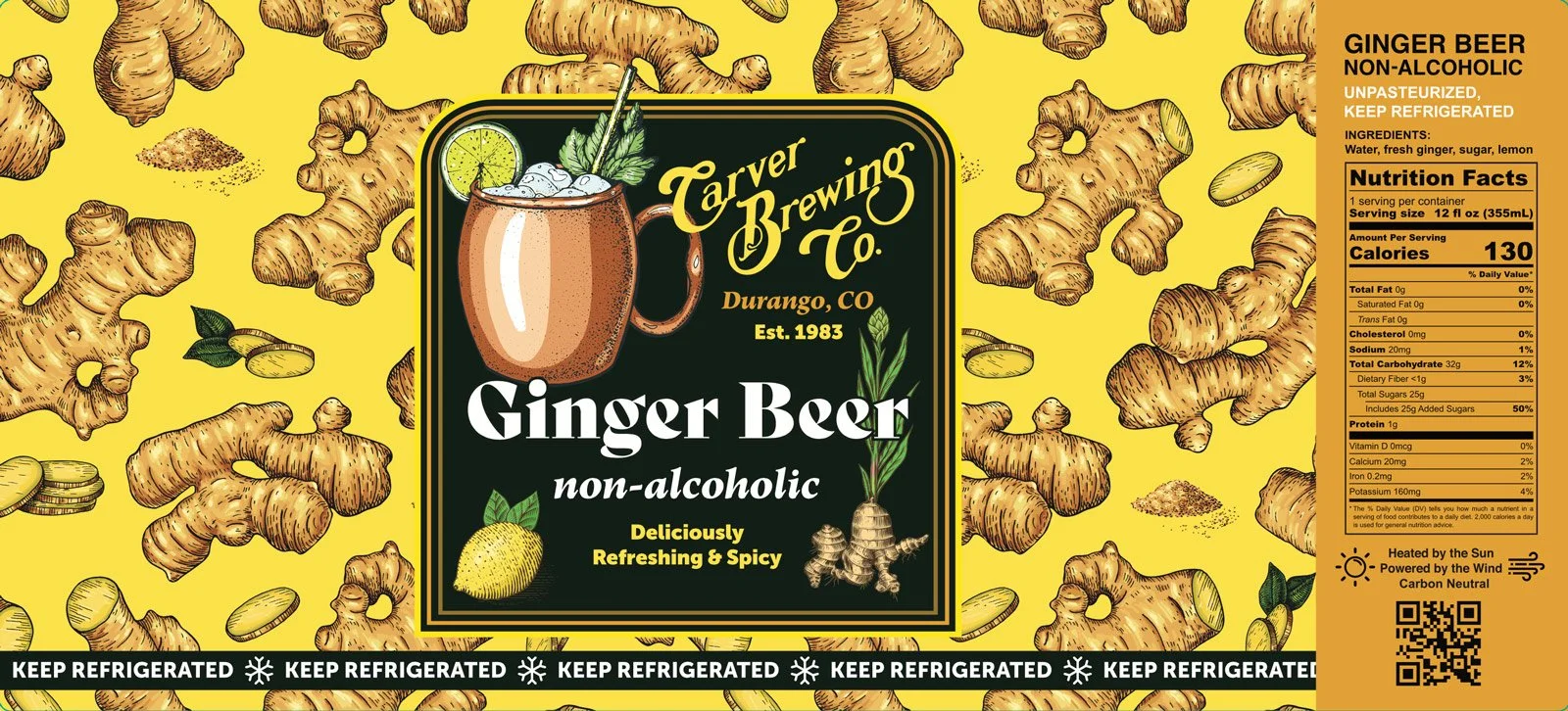
Founded in the 1980s, Carver has long been a staple of Durango’s craft scene and one of the earliest brewpubs in the region. The goal was to evolve their packaging while staying rooted in the brand’s mountain-town heritage. I led the design of multiple label systems, creating original artwork and visual identities that could differentiate each product while still feeling cohesive as a brand family.
The Problem
Carver had strong product quality and local recognition—but their packaging lacked a unified, modern expression.
Labels varied stylistically without a clear system
Products didn’t stand out on shelf in a crowded craft category
There was an opportunity to better reflect Colorado, Durango, and mountain culture
The brand needed a way to balance heritage with a more contemporary visual language
The challenge was to create packaging that felt distinct, ownable, and scalable across SKUs.
Opportunity
Use illustration and storytelling to turn each beer into a memorable, visual experience.
Create a system where each label feels unique—but unmistakably part of the same brand world.
Approach
1. Build storytelling into each label
Rather than treating labels as purely informational, I designed each one as a narrative moment.
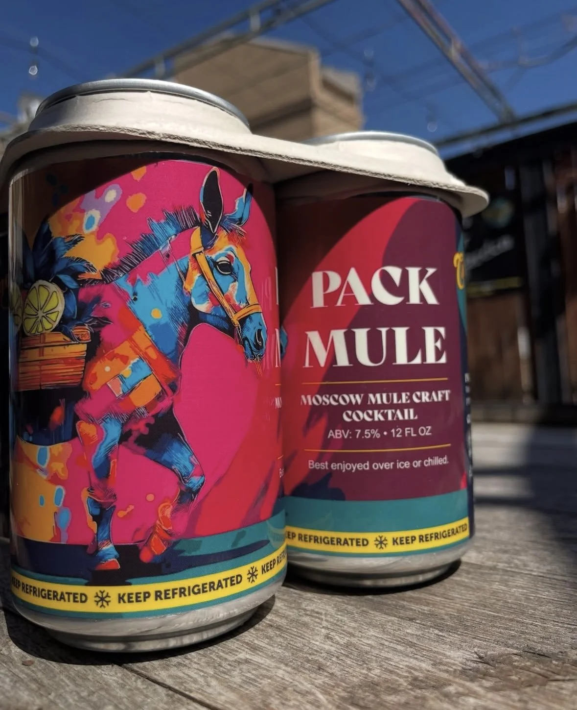
Pack Mule Moscow Mule → vibrant, expressive mule illustration reflecting energy and flavor
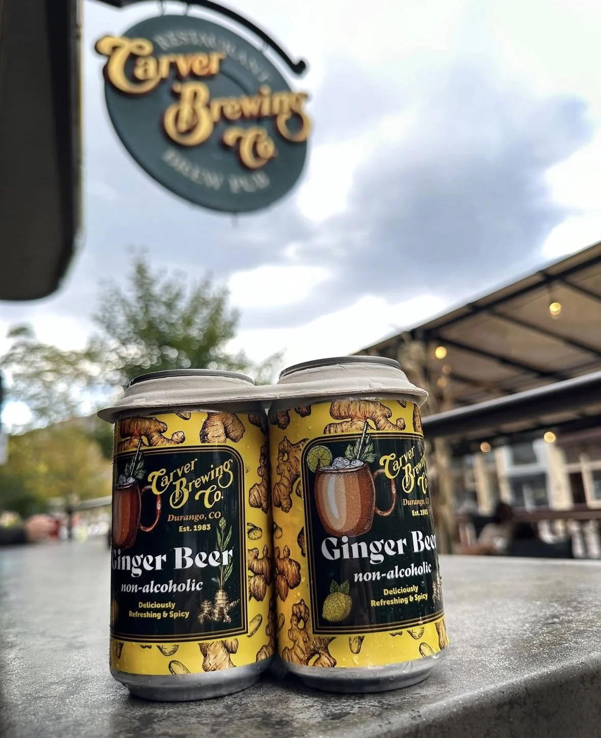
Ginger Beer → ingredient-forward system highlighting ginger and citrus in a bold, repeatable pattern
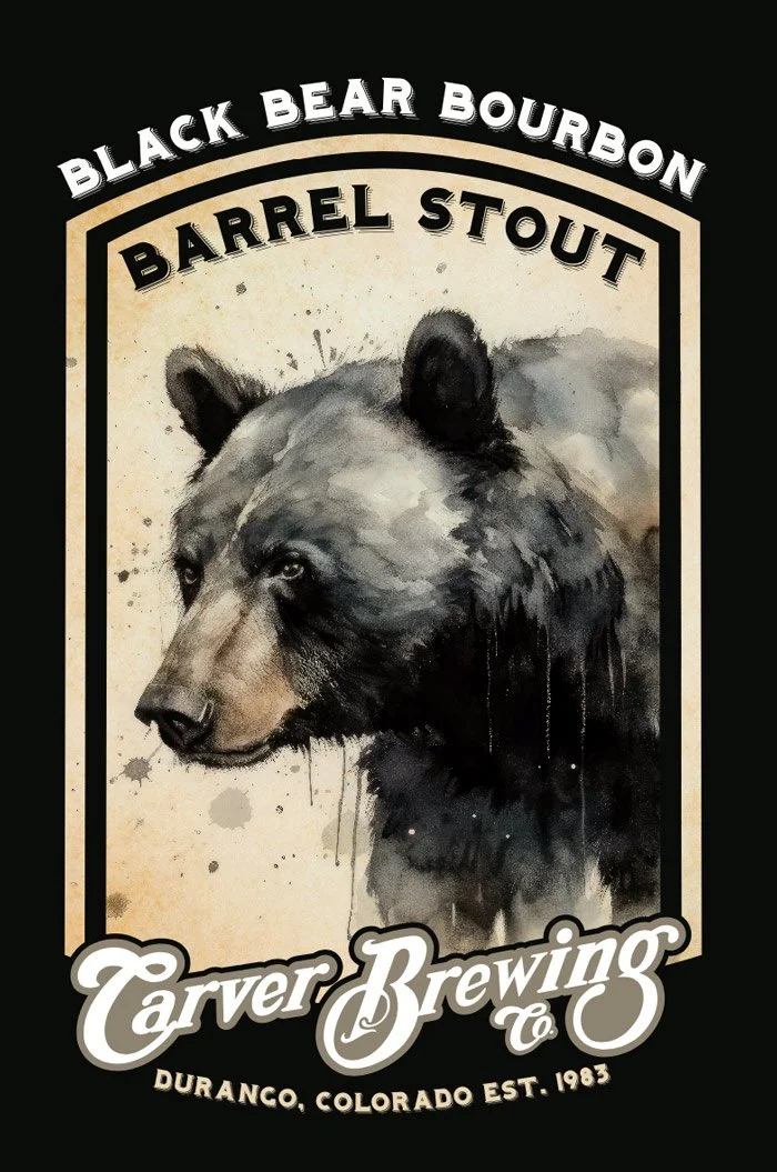
Black Bear Bourbon Barrel Stout → rich, atmospheric illustration emphasizing depth, strength, and craft
Each label became a character within a broader brand ecosystem.
2. Create original illustration systems
I developed custom artwork for each product, leaning into:
Hand-crafted, expressive illustration styles
Bold color palettes to differentiate SKUs
Visual storytelling rooted in nature, animals, and ingredients
This helped the products stand out both individually and as a collection.
3. Balance heritage with modern expression
Carver is a legacy brand, so the design needed to respect that history while pushing things forward.
I balanced:
Classic typography and structure (credibility, craft)
Contemporary color and illustration (energy, shelf appeal)
This created a look that felt both grounded and fresh.
Wall Banner
Beer Label
4. Design for shelf impact and real-world context
Craft beer is highly competitive—labels need to work instantly.
I focused on:
High-contrast color systems for visibility
Clear product naming and hierarchy
Designs that stand out in both retail and social environments
Warning labels for refrigeration when needed
The goal was immediate recognition from a distance—and reward up close.
5. Build a scalable packaging system
While each label is unique, they share a consistent framework:
Structured layout for product information
Consistent brand placement and hierarchy
Flexible illustration zones
This allows new products to be added without reinventing the system.
Impact
Created a distinct, illustration-led packaging system across multiple products
Elevated shelf presence in a competitive craft beer market
Strengthened brand storytelling through visual identity
Balanced Carver’s legacy with a more modern, expressive direction
Built a foundation for future product expansion and seasonal releases
What I Learned
This project reinforced a key idea about packaging:
The best labels don’t just describe a product—they make you feel it before you taste it.
By combining illustration, color, and structure, we turned each beer into a story—one that connects with customers instantly.